Data visualization roundup
August 23, 2007Anand pointed me to a roundup of cool data visualizations. My favourite of the bunch is Elastic Lists:
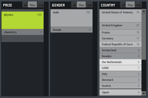
Elastic lists are a technique for browsing multi-faceted data structures. A multi-faceted data structure is one that is structured by several different attributes — in this example, Nobel Prize winners are grouped by the area (physics, chemistry, etc.), nationality and gender of the winner, and year. What I really like about this visualization is how the relative weights of each of the metadata values are represented by the size of the box. You can see in the image above that the box for male is much bigger than the box for female, indicating that there have been more male winners of the Nobel Prize in physics.
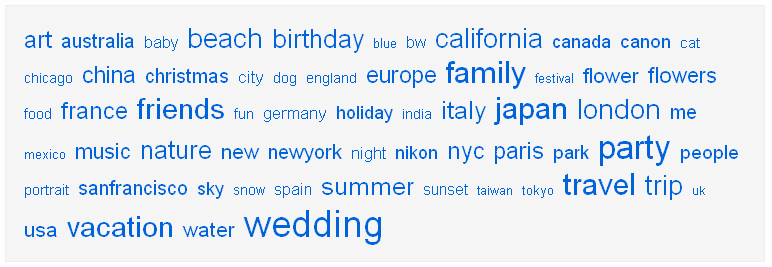
The technique is similar to the now-ubiquitous tag cloud (an example from Flickr above), but I like the approach from Elastic Lists better, because it’s more subtle. I find that some tag clouds tend to punch you in the face with the main terms, but this approach gives the words themselves equal footing, while still providing some useful secondary information.