Usability mistakes with radio buttons
September 26, 2007 ⋅ 7 Comments »Here’s a beauty for you. I’m submitting an application for graduate funding to NSERC, a Canadian governmental organization that funds research in engineering and science. This is an actual example from their online scholarship application:
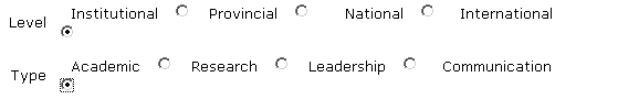
What’s it look like I’ve selected? “Institutional” and “Academic”, right? Nope. It’s actually “International” and “Communication” that’s selected. Yikes. How did no one notice this during development?
Even if that radio button hadn’t somehow strayed down to the next line, putting all the radio buttons inline with the descriptions is a bad idea. Here’s another example, from the Wordpress comment moderation page:

The problem with this layout is that you spot the option you’d like to select, but it takes a sec to figure out what radio button is associated to it. You have to look at the ends of the lines to figure out how the mapping works. Every time I mark a comment as spam, I have to double check that I’m not actually approving it instead.
Anand - September 27, 2007:
Putting radio buttons online is compact man, it makes sense for a long form. As long as you disambiguate with lots of spacing between the radio button + text and the next one I think you're fine.
I love their beautifully rendered text though.
Speaking of alignment issues, your Post a comment link on the topmost entry is appearing way out to the right for me, past the right-hand sidebar.
Patrick - September 27, 2007:
Anand:
You're right, if the spacing is done right, it would be much better. You just have to make sure that you don't have a button or label wrapping down to the next line.
About the font rendering, you can thank Windows for that. The first one is just plain Verdana, the second is Lucida Sans Unicode. I have ClearType turned off because I the Windows font rendering looks like ass (well, specifically the colour that appears on the edge of the letters).
Interestingly, I discovered that my Windows installation has both "Lucida Sans" and "Lucida Sans Unicode" installed, and the two fonts are very different. Plain-vanilla Lucida Sans looks a lot better than the Wordpress example above.
And I'm aware of the problem with my comments link...yeah I know, it sucks. I'll be moving to a new design soon and it will be fixed.
Ryan Lowe - September 28, 2007:
Another thing that helps is using form labels properly. You can give each radio a unique id and point to it from the label tag. When you click on the radio's text label, the proper radio is selected.
Patrick - September 28, 2007:
Ryan:
Being able to click on the label instead of the button would definitely be more clear, but if the buttons are still there, it's kind of "hidden functionality", isn't it? It might not be obvious that you can click on the labels, and the radio buttons would still be ambiguous.
Ryan Lowe - September 28, 2007:
Being able to click on the labels has been built into Windows GUIs since the 3.1 days. It might be more intuitive than you think. :) But yes, the radio position relative to the text is critical as well!
Anand - September 29, 2007:
Even better, if as you hovered over the label (text or button) it had a subtle highlight appear underneath both. A nice pastel color or something.
I was making fun of the font but looks like my firefox was acting up and scaling up the images. What i saw was much uglier than whats up there now.
In your new blog design, make sure you have better distinction between the comments on the comments page. They just blend right together. Also maybe make the "Comment by" text smaller?
Patrick - September 29, 2007:
Good points about my design :-) The comments was the last part I did, thinking I would eventually revisit and fix them up. But you know how it goes...