Graphics for summarizing customer reviews
October 1, 2007A few weeks ago, Joshua Porter wrote about how Amazon.com improved the way they display a summary of user reviews:
For years Amazon’s interface showed the average review, so viewers could tell the general mood surrounding a book. If it was a 5 star or a 1 star book, then that would be instantly recognizable.
But over time it became clear that the rating system had a fault: if the average rating was somewhere in the middle, say 3.5 stars, it was unclear whether it was just a dull book that most people rated as mediocre or if it was a polarizing book that half the people rated 5 and half the people rated 1. A political book, for example, usually polarizes.
The solution they came up with is a graphic that shows not only the average review, but also the distribution:
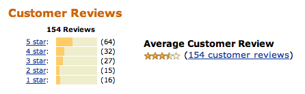
I like the new visualization, but I still find that the meaning doesn’t really jump out at me. I have to really concentrate for a few seconds to grok the graphic.
I just ran across another take on this problem. David Abbet points to a much simpler solution:
Instead of using stars, Summize displays color bars which summarize the reviews: the more green, the more positive they are. Where stars only give an average rating, those color bars really add some depth to the information.
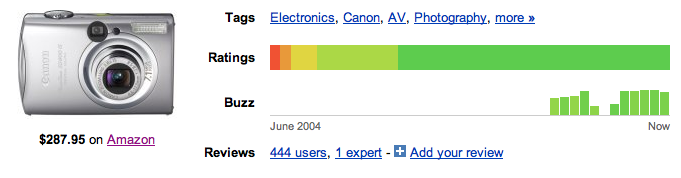
I like it. Much easier to understand at first glance, I think. And as swissmiss points out, it’s cool that both their logo and their favicon reflect the style of the color bars.