Removing debris from your interface
October 21, 2008There are a few things I’ve been meaning to write about for a while now, and in a burst of inspiration today, I realized I can probably tie them all together in one post. Here goes.
Fennec
Fennec is the name of the upcoming mobile Mozilla browser — think Firefox for your phone. I’ve been keeping an eye on the development for a while, especially the UI design discussions that Aza and Madhava have been having. Things are really coming along…last week Madhava posted a walkthrough of the first alpha version:
Fennec Alpha Walkthrough from Madhava Enros on Vimeo.
One of the coolest things about Fennec is that it dedicates the entire screen to web content. Pixels are precious on small screens, so you don’t want to waste them on controls that you aren’t using. On the iPhone version of Safari, the title and URL bar are fixed to the top of the page, so that as you scroll down, they disappear. But the navigation bar — with the back, forward, and bookmark buttons — remains fixed at the bottom of the screen. In Fennec, the title and URL bar also disappear when you scroll down the page, but the other controls aren’t at the bottom — they’re accessible by dragging the page to the left or right. Check out the video to see what I mean.
Edward Tufte would be proud: “the content is the interface, the information is the interface — not computer administrative debris.”
Computer Administrative Debris
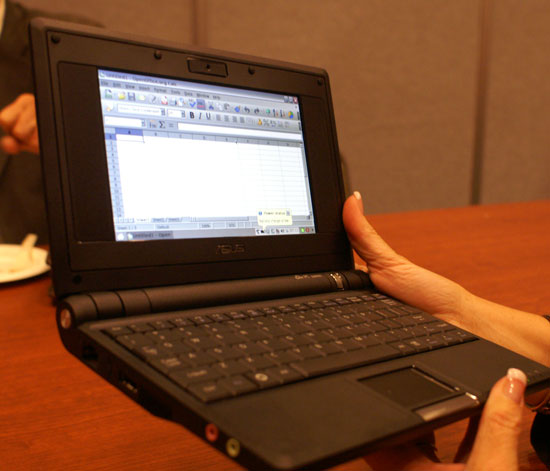
In his critique of the iPhone interface, Tufte praises the iPhone interfface for minimizing “computer administrative debris”: the buttons, menus, labels, etc. that steal content space away from the users. This is becoming a serious problem as we continue to shoehorn our desktop interfaces into smaller and smaller screens. For example, take a look at an Asus EeePC running Excel:

Barely half of the available screen space is actually taken up by the content.
On larger screens, losing a little content space is not a problem. But then, I find it causes another problem: it’s distracting. My monitor is too big to run apps at full screen, so I have no choice but to work with clutter all around the window I’m focusing on.
Debris on the web
Inspired by Tufte’s coinage, Ryan Tomayko redesigned his web site to remove all of the “computer administrative debris” earlier this year. When I saw it back then, it caught my attention. I thought it was definitely an interesting experiment, but I thought it went a bit too far, although I couldn’t quite pinpoint what I didn’t like about it.
Earlier this afternoon, I was procrastinating on my thesis work, looking for inspiration for the long-promised redesign of this blog. I want to stick with something minimal, and I remembered Ryan’s site, so I swung by to check it out again. This time, I was able to put my finger on what I don’t like — it’s the missing title and navigation bar.
The thing is, without a title and navigation bar, the user is missing a lot of important context. When I visit a web site, I’m happy to see a small banner across the top with a few navigation links, because it quickly gives me some important context about the content I’m looking at, and about the site itself. It’s not strictly necessary, but that’s fine as long as it doesn’t get in my way, and lets my focus on the content. And the way most sites implement a navigation bar, it disappears as soon as you scroll the page, like the URL bar in Fennec. So it’s not persistently in your face, or wasting important screen space.
The other thing a navigation bar does is give you some idea about where the links lead. When I follow a link labeled “about” from someone’s blog, I have a pretty good idea where it’s going to take me. But if I just click on the person’s name, I’m not sure — maybe it’s a mailto link (note: I’m guilty of this one too).
So, by all means, let’s eliminate useless administrative debris. But be careful; you aren’t just moving functionality, you’re also removing important contextual information.