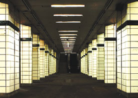
White night, dark station
October 3, 2007This past Saturday night was Nuit Blanche Toronto, “a free all-night contemporary art thing.” The original Nuit Blanche was held in Paris in 2002, and since then the idea has spread to cities around the globe. The success of last year’s Nuit Blanche in Toronto convinced the organizers to make it an annual event.
Without a doubt, it was one of the most fun and interesting things I’ve done since I moved to Toronto this year. It’s events like this and Pedestrian Sundays in Kensington Market that really make me love this city.
One of my favourite exhibitions was The Ghost Station installation by Kristen Roos. It was a sound installation in Toronto’s abandoned subway station, Lower Bay Station.
Lower Bay Station, Toronto’s ghost station, is used as a vessel to contain sounds that are within and below the threshold of human hearing - infrasound and tactile sound - where sound is felt rather than heard. Low frequencies created by cars and subways are contributors to the cacophony of infrasonic noise that exists deep below the rumbling of the city. These tactile sounds have also been associated with paranormal activity and ghost sightings.

It was cool just to be in Lower Bay, which is generally closed to the public. But the rumbling, rattling, and thumping sounds, as well as the sounds of active trains running overhead, gave the whole place a creepy, surreal feel.
Speaking of the Toronto subway, I recently ran across a cool article by Joe Clark: Inscribed in the Living Tile: Type in the Toronto Subway. If you’re not from Toronto, or not a typography geek like me, you might not know that Toronto has a unique font that is used in a lot of its signage:


Joe’s article talks about the history of the TTC subway font (the designer is unknown) and the TTC’s lack of typographic consistency:
You might not expect something typographically unique to come out of Toronto, a B-tier city that stands in the shadow of A-tier cities even in the minds of some residents. But the margins are where originality can thrive, and the typography of the Toronto subway is a prime example. It is also an example of subverting, ignoring, and actively destroying a special typographic heritage – quite an achievement considering that the type involved is almost a foot high and permanently sandblasted into subway walls.
Thanks to Ryan Lowe (via Hey! Heads Up) for the tip.